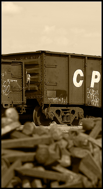
A great concept and very nicely executed. Unfortunately, the sky also hurts this image in a similar fashion to an earlier entry. It would have been vastly improved by bringing out the details in the sky to balance the image more effectively. Again, an image that could have gone horribly wrong, it's almost at the break point between being brilliant and merely above average. A little more use of the zone system would have improved this tremendously. As it is, a very worthy entry into the challenge with top twenty potential.






 Add photograph to your favorites
 Add photographer to your favorites


 Photographer found comment helpful.

