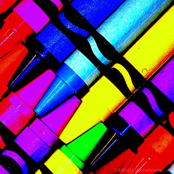
I appreciate your processing and your courage with this image. It might not go over very well with the masses but it's got a certain pizazz that I like.
This one is tough to judge, because as a graphic it rocks; great crop, vibrant and dynamic, it would make a great offset print. As a pure photograph the density of saturation washes out the subtle textures and I can hardly tell where the rough paper ends and the waxy crayon begins. On a different site with less obsession over technical mastery it would be a no brainer, because the image grabs you by the throat. I'm going to have to give it a provisional score and come back.
Opinion on the post processing of this is obviously going to be a very personal thing. Not doing much for me but thank you for giving me something other than close ups of crayons in colour spectrum order.
The author had a great idea, but failed to create an imact that has a positive impact. The over saturation of color doens't enhance the image's impact and is a negative. However, the idea is sound and with a little more thought on the part of the author, it would have been a top twenty image.






 Add photograph to your favorites
 Add photographer to your favorites


 Photographer found comment helpful.


