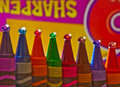
curious how you did this....can't really say that I really like this to much but I can't really pin point what I don't like....I guess it seems to "gloppy" for me...
Nicely done, the orange and yellow crayons and paint look good. It would have been better if the purple crayon was blue to go with the blue paint. JMO!
A very creative look at crayons - the image meets the subject matter dead on with subtle, yet detailed effect. A terrific demonstration of the creative process in meeting the challenge in a very unusual way. Should be a sure bet to win a ribbon or place high as a top twenty image. A couple of minor detail problems not worth mentioning because they don't appear until you really get a critical eye and examine the image closely. Another image that deserves consideration if there were a DPC Hall of Fame. Well done.






 Add photograph to your favorites
 Add photographer to your favorites


 Photographer found comment helpful.


