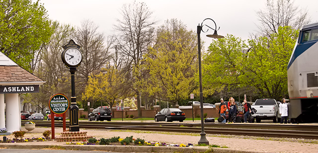
I don't really think there's much going on here to pull in the viewer. It feels like your camera was around your neck and it accidentally took a shot. There's not real subject, the train is barely in the picture, the people are too far away to be the subject, the lamp post and the clock seem to be the subject. There's just not enough focus here on an acutal subject for me.
In my humble opinon, I would have liked to see more of the train. I think it would have filled the void within the center of the photo. Aside from that. I like the way you captured multiple aspects of railroading (train, rails, clock, station, people) all at once.
From a technical standpoint, this is a good effort - crisp, sharp with everything detail well controlled and captured. From an artistic standpoint, it's rather bland and uninviting to the viewer. Sometimes an image, even one as technically competant as this one is, is just an image. A worthy entry into the challenge and directly related to the challenge subject. A good effort falling short in the artistic sense.
Too many distractions here. A point of view with the clock and the train engine next to oneanother or just closer together would have been better, a much tighter shot.





 Add photograph to your favorites
 Add photographer to your favorites


 Photographer found comment helpful.


