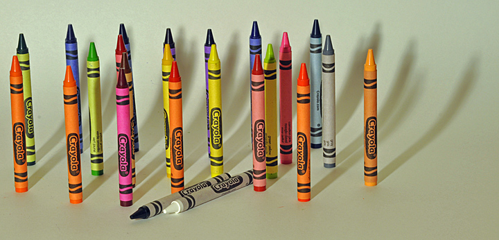
a fill light and bringing the crayons farther up off the background would have reduced the shadows and the shadow curve and helped the colors to pop a little more.
Neat shot. Too bad you have a few specs of dust, especially the one just a little to the right of center about 5/6th of the way down. Maybe a bit white background and more saturation in the colors would have worked to really bring out the crayons.
A very creative look at crayons - the image meets the subject matter dead on with subtle, yet detailed effect. A terrific demonstration of the creative process in meeting the challenge in a very unusual way. Should be a sure bet to win a ribbon or place high as a top twenty image. A couple of minor detail problems not worth mentioning because they don't appear until you really get a critical eye and examine the image closely. Well done.
I think the shadows are a bit distracting and thte white background should be whiter to make the colors really pop. It seems like all the colors got together to take out the black and white. Composition is a bit dull as well.





 Add photograph to your favorites
 Add photographer to your favorites


 Photographer found comment helpful.


