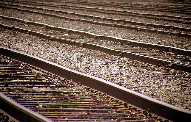
I like the concept of the parallel lines and the distortion caused by the heat, adding some interesting dynamics to the image.
As it was noted, maybe if you had added an element of abandonment (e.g. an old shoe, or any trash) would be more appealing to voters. Also, you should have use the maximum size allowed for the image (800 pixels wide), which always help bring the details up.
From a technical standpoint, this is a terrific effort - crisp, sharp with everything detail well controlled and captured. From an artistic standpoint, it's rather bland and uninviting to the viewer. Sometimes an image, even one as technically competant as this one is, is just an image. A worthy entry into the challenge and directly related to the challenge subject. A good effort falling short in the artistic sense.
Although I think this idea is cool and the lines look great, I think this pic is lacking something of a central focus. This feels more like a background than a subject to me, and I think if there were something that stood out fromthe tracks it would pop more.





 Add photograph to your favorites
 Add photographer to your favorites

 Photographer found comment helpful.


