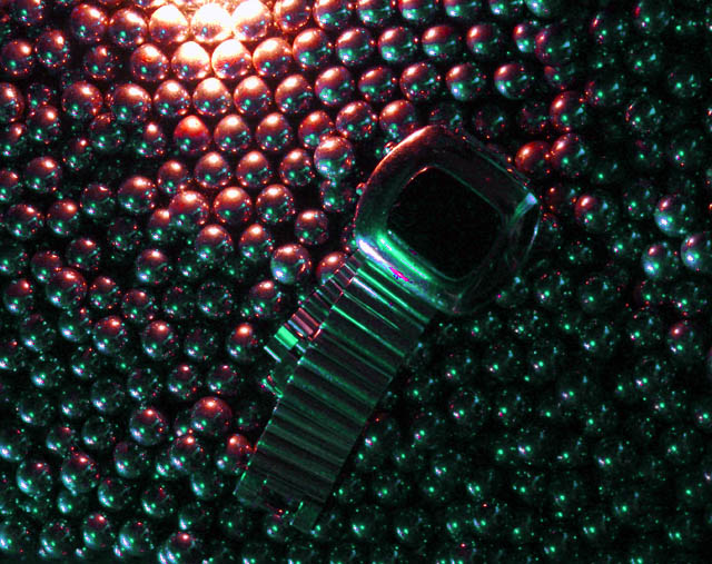
The placement of the watch against this background makes for a confusing composition. It's a rather noisy image and there are quite a few hotspots (the edge of the watch face and the top edge of the frame). The bead thing is rather interesting as an abstract and I encourage you to work on the lighting some more and see what you come up with.
It's got some strange color splotches going on, most noticably on the face of the watch. This is one that may have benefitted from Neat Image. Otherwise, it's got a nice composition and I like the choice of colors.
This is rather dark and indistinct, even on my bright mac monitor. And the bottom edge of the (watch?) face seems to have a lot of cmopression artifacts along the hilites, maybe a photoshop issue?








 Add photograph to your favorites
 Add photographer to your favorites


 Photographer found comment helpful.


