Initial impression: very interesting concept and execution, a refreshing look at crayons. Risks coming across as dull until you really look at it.
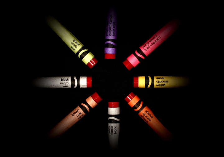
Technical: The centred comp works well here as does the plain black b/g; the red stubs do all look like they belong to each crayon. Like the vignetting, helps to draw attention to the middle.
Artistic: The idea behind this shot is what really sells in imho, that the outer packaging is just that and nothing more. Using a circle is perfect because it is the universal symbol of unity. Like that all the colours' labels show too.
Overall a nice, clean shot that carries a message which I hope others latch onto. And looking at your final score and placing, I'd say you did a good job of that. Well done!
Intriguing pull towards the centre...like looking into an eye - the crayons all forming the iris. I would just make the quibble that the "green" breaks the perfect circle.
A very creative look at crayons - the image meets the subject matter dead on with subtle, yet detailed effect. A terrific demonstration of the creative process in meeting the challenge in a very unusual way. Should be a sure bet to win a ribbon or place high as a top twenty image. A couple of minor detail problems not worth mentioning because they don't appear until you really get a critical eye and examine the image closely. Well done.





 Add photograph to your favorites
 Add photographer to your favorites

 Photographer found comment helpful.


