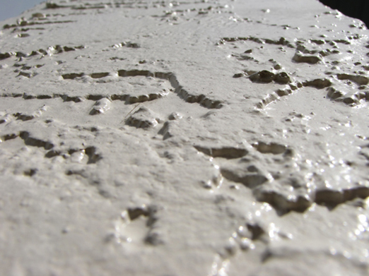
interesting texture. the glare is a little distracting and artistically, it doesn't do much for me. although, i do like how the top corners are symmetric and different colors
The author's intent with respect to titling the submission is a good concept. This is a hard image to rate if only because the overly white tone and slightly over done white blooms. It might have scored better with the rather vague bottom third cropped out.





 Add photograph to your favorites
 Add photographer to your favorites


