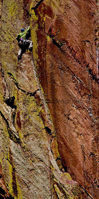
This photo doesn't work for me. This could have used a different angle if possible, maybe from below looking up to get a bit of the sky in the shot? The subject doesn't stand out as much as I'd like.
Another great choice for a motivational poster. The image is a little too long and could be cropped at the bottom without affecting the overall impact on the subject and that type of crop would present the subject more favorably and concentrate the viewer on the subject's efforts to get to that position. A solid effort.
When I first looked at this image I didn't see the guy right away. With that said I think you should have subtracted a lot of the rock from the image and got it to look more like a stock photo. I just don't see someone adding this much rock to a website or some other advertising item.
If I were to vote on this I would probably give it a 4. If you had less rock in the image I would probably give it a 6 or 7.







 Add photograph to your favorites
 Add photographer to your favorites


 Photographer found comment helpful.


