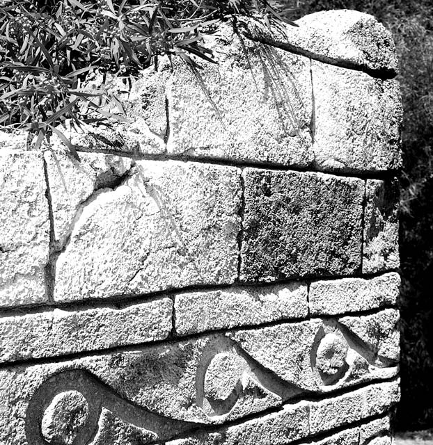
Not exactly sure why I entered this one instead of the other two I had below. I really liked the black and white and after comments on my last black and white, I thought I had upped the contrast and brightness enough to make this better. Apparently I did it a little too much :-)
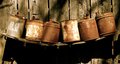
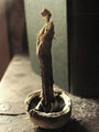
Here are my other two possibilities:
Statistics
Place: 227 out of 334 Avg (all users): 4.8939 Avg (commenters): 5.6667 Avg (participants): 4.9885 Avg (non-participants): 4.8043 Views since voting: 685 Views during voting: 238 Votes: 179 Comments: 8 Favorites: 0
Well post challenge seeing your out-takes I agree about the comments on the brightness/contrast and really think that green cactus would have scored better than this one did. I was one of your many 5's. It was a good entry though.
An interesting choice for meeting the subject challenge. The image could be a little more dramatic if a better choice of contrast had been made using the zone system. A little less light would have helped this image score higher. A good, solid entry into the challenge.
The lighting is too harsh here. The over exposure is causing you to lose depth, detail and texture in the stone. I think with the right lighting, or exposure, this could be a great way to show texture.





 Add photograph to your favorites
 Add photographer to your favorites


 Photographer found comment helpful.


