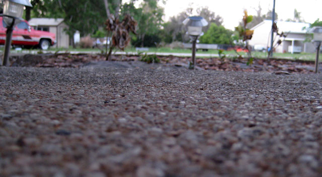
Pity it's all so out of focus. I think it would have been better if you had taken this photo straight down to the ground or if the foreground would have been real sharp.
Interesting DOF but I would have much preferred to see a different angle on this one. The upper half of the picture really does nothing for this one. Maybe even having the DOF much closer to the camera.
this does show texture, but if you had narrowed your field of vision you could have cut the car out on the left and the house on the right...and picky me (I'm quite OCD)...I would have straightened the light in the center.
This would have worked much better with a sharper foreground fading to the background. The background needs less detail to be truly effective. A nice low level angle and a very good concept less than expertly executed. Average for this competition which has been excellant so far.





 Add photograph to your favorites
 Add photographer to your favorites


