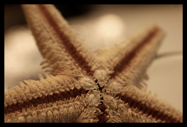
technically this could be improved with a bump up in exposure and some curves. Shallow dof is okay but just a little more depth would be better I think.
this is an excellent idea...but I wish your sharpness of focus would have been carried through the picture more, just a little higher...your OOF field dominates the photo, and colors are a little dull (or dark)
Only the lower 25% could be considerd "texture" in a strict interpretation as the DOF is slightly overdone. A slightly taller angle would have given better control of DOF imparting a better sense of detail fulfilling the theme of the challenge. Having said that, the overall color tone control is excellant with subtle shade differences that are very hard to pull off with success and the author has done well in this area. A good effort.






 Add photograph to your favorites
 Add photographer to your favorites


 Photographer found comment helpful.


