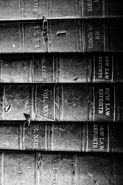
90 degrees to the left would have been a better orientation imo since most people try to read the words when there are words in the shot. Having to rotate my head to read it. Maybe you did it to discourage reading the words and encourage viewing the texture but the mind works the way it works.
Very subtle lighting from the side creates a very antique looking grain effect - this works very well as the creases on the bindings show years of use. The viewer can extract the canvas book bindings without much effort imparting a sense of time and space. A excellant effort.
I think this would have looked better flipped to the left so the words could be read. Not necessarily that the words are what would make that look better, but I think the lighting would work better.





 Add photograph to your favorites
 Add photographer to your favorites


 Photographer found comment helpful.


