| Author | Thread |
|
|
04/17/2009 08:51:27 PM |
|
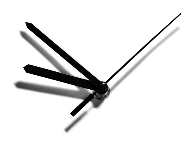
*sigh* I'm sorry, Abs. Perhaps you could have just put a really thin line of black there and then a wider white? What was your score before the DQ? I wonder why they picked yours to validate. |
|
 Photographer found comment helpful. Photographer found comment helpful. |
Comments Made During the Challenge  |
|
|
04/14/2009 12:24:10 PM |
|
| Photographer found comment helpful. |
|
|
04/14/2009 04:56:40 AM |
|
very clever idea , so subtle |
|
| Photographer found comment helpful. |
|
|
04/12/2009 01:22:14 AM |
|
|
|
04/11/2009 11:45:33 PM |
|
|
|
04/09/2009 10:59:10 PM |
|
Great idea for an add campaign, very clever. The image has neither complexity nor bright and shiny colors, but you knew that going in. |
|
| Photographer found comment helpful. |
|
|
04/09/2009 09:02:05 PM |
|
Great image but a stretch to meet fitness. 5 |
|
| Photographer found comment helpful. |
|
|
04/09/2009 12:37:53 PM |
|
This would be nice for an abstract challenge but I don't get the fitness correlation. |
|
|
|
04/08/2009 06:06:24 PM |
|
Interesting creativity. Am I correct that the second hand moves more so its thinner (in shape), and the minute hand is medium movement/medium build and the hour hand is a slug/fat??? This is creative. okay 10 |
|
| Photographer found comment helpful. |
|
|
04/08/2009 04:28:43 PM |
|
I don't really see how it ties into fitness, unless maybe its the change in the width of the hands, but it is an excellent shot! |
|
| Photographer found comment helpful. |
|
|
04/08/2009 08:59:51 AM |
|
I think this would be more appropriate for a challenge called "Stock Photos: Time". It's a nice pic, I love the high contrast, the shadows, but I really don't think it meets the challenge theme, even with the title. |
|
|
|
04/08/2009 08:02:13 AM |
|
As an abstract concept, this works well with the title. It could work in any number of fitness venues as a motivational poster with different phrases. A very out of the ordinary way of looking at the challenge subject. Technically excellant with a minor flaw not worth mentioning. Well done. |
|
| Photographer found comment helpful. |
|
|
04/08/2009 02:35:40 AM |
If you have to use the title to make a connection with the challenge then IMO it doesnt meet the challenge.
As far as the image goes it's nice and simple with good use of intentional shadows. Looks slightly over sharpened though. |
|
| Photographer found comment helpful. |
Theme:
Classic /
Light /
Dark
Home -
Challenges -
Community -
League -
Photos -
Cameras -
Lenses -
Learn -
Help -
Terms of Use -
Privacy -
Top ^
DPChallenge, and website content and design, Copyright © 2001-2026 Challenging Technologies, LLC.
All digital photo copyrights belong to the photographers and may not be used without permission.
Current Server Time: 10/09/2026 04:54:01 PM EDT.






 Add photograph to your favorites
 Add photographer to your favorites


