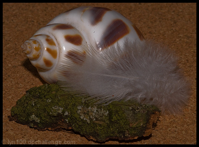
A solid entry into the challenge, it meets the criteria in a different and unique way. From a technical standpoint, the image is a more than adequate even though it is underexposed and less saturated than it should be. The artistic impact is interesting and is a plus. A more than adequate entry into the challenge.
cool -- definitely like the idea. Only two things I'd suggest: 1) something black or white, maybe, on the cork-board?, and 2) lighting is a bit flat (I know that's not a suggestion, but I know basically squat on how to improve upon lighting situations, so I'd be talking out my butt if I actually did suggest anything on this point). ;)
some interesting textures here but it could be improved by some basic adjustments to the Levels and maybe the addition of a S-shaped curve to enhance the contrast a little





 Add photograph to your favorites
 Add photographer to your favorites


 Photographer found comment helpful.


