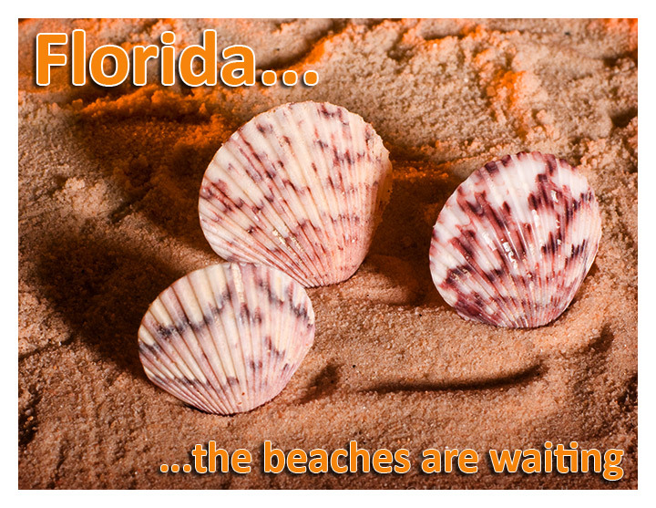
Seeing the orange light in the areas right behind the shells gives me the impression that there was a grand sunset or sunrise going on at about the time you shot this.
It's a good postcard of the type seen in this area, and those are common shells at the beaches here. The font looks sort of 60's ish, which fits with the theme nicely too.
Great detail in this shot, but for a postcard it feels a bit too tight. If I was looking for a beach postcard I would be looking for long empty expanses and blue skies / blue water.
Another great example of form meeting function and matching exactly. Perfect image - the highlighted generic font style works very well, the subject matter is perfect, colors are what they should be and the image itself is crips, sharp and very nicely composed. A perfect postcard. Well done.






 Add photograph to your favorites
 Add photographer to your favorites


 Photographer found comment helpful.


