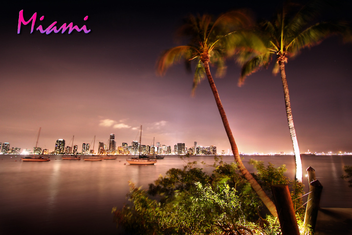
love the combination of blur and sharpening throughout the palm trees! it works well for me since it incorporates miami into one..the tropical aspect with the busy city in the background! very nice!
I'm not sure how this made it into my top 5. I just kept a look at it, and it grew on me steadily. I really think it says MIAMI, and the colors are fabulous. There is some blown out whites, and I'm not crazy over the text, you can obviously see there was some wind in the trees and shrubbery that hindered the photo a bit, but I never subtracted for it, because I personally like the setting it sets. I really dig the balance of the composition, the way the buildings end, and the trees fill in the space.
great job, good luck. 9.
Great shot, this is one of my favourites so far. I think the boats and the palm trees make this one. The text is also nicely done, and fits the shot well.
first of all its great concept.. its different, colorful , moving..
one thing bug me though.. the white light on the right tree... you have to dodge it a little bit..
9
The whole pastel tone of this is Miami - a perfect representation. The singluar flaw is the white bloom on the palm tree - it draws the eye away from the rest of the image and severely impacts the overall effect. The author might have done better to clone out the white bloom or crop it out entirely. Crockett and Tubbs would have approved of this image.






 Add photograph to your favorites
 Add photographer to your favorites


 Photographer found comment helpful.


