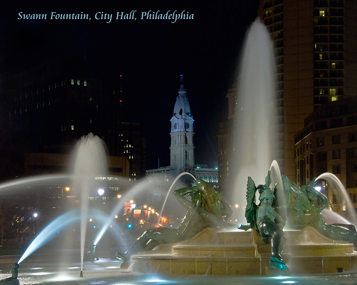
Challenge no. 600. This is for Bev. She loves the Swann Fountain, especially at night. I shot this during the day yesterday and did not like especially because the center fountain was not running nor any from the river figures. So I went back tonight not intending to shoot it again but when I saw all the fountains running and the night light I went with it. Bev will love it.
Post: Camera Raw adjustments in PSElements 6.0. Layer adjustments for levels, brightness/contrast and hue saturation. Curves Adjustment, lighten shadows. Adjust sharpness. Spot edit a green neon sign for eCellRX a) cause it is a pharmceutical concern in the building where I used to W--K and b) Just looked out of place and would do nothing to promote the city. Also cloned out a thin line of a building that was right above the sign. Burnt some lingering rays of a spot light that shines on the fountain on the left...cropped most of it away but the rest had to go. Add text. Resize. USM.
Statistics
Place: 21 out of 163 Avg (all users): 6.4944 Avg (commenters): 6.6923 Avg (participants): 6.3281 Avg (non-participants): 6.5877 Views since voting: 2006 Views during voting: 333 Votes: 178 Comments: 16 Favorites: 1 (view)
Great postcard style shot. Good exposure, lighting and colours. Looks like you have cropped a little of it out though judging by the aspect ratio, and I think it would have been better to get the whole fountain in the frame since that is your subject.
For some reason this has reminded me about some national talk show absolutely awful song about Philadelphia. He needed more than a bucket to carry the tune. It was pretty bad. Your entry is much better than that song was.
well maybe not, i guess the rest of the image is pretty prefect, not sure how you managed to get the lights right on sigh a disparity of subjects, but there they are, just as they should be in a postcard. I'll give it an 8 and a ribbon prediction, even though I really don,t care for the font.
An iconic image of Philadelphia. The highlights are a touch over done, but it does evoke the impression that somebody has been to Philadelphia. The font is appropriate as is the color, but it's placement is too high and could be brought lower to fill in the dark void above the buildings on the left.






 Add photograph to your favorites
 Add photographer to your favorites

 Photographer found comment helpful.


