|
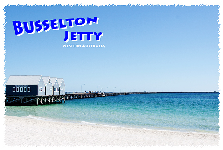
A lot of blank space and too much blue. The frame also disappear at the bottom - might have been better to use black or a deeper color to make it effective. The font is fine, but the placement is problematic - it would have been better on the right to fillin some space. |






 Add photograph to your favorites
 Add photographer to your favorites


 Photographer found comment helpful.


