lol. Right down the block, that is. Probably one of the more "famous" postcards. Hope it does well, gotta break my sub-6 streak!
post - Wow. Thanks to one and all, I'm floored by the scoring in this challenge. Wonderful comments and a fave to boot. To think, this was a last minute "get out there for half an hour and create the image in pp 15 minutes before rollover". Maybe I should stick to that formula, any time I actually plan an image, I end up in the 50th percentile. ;-)
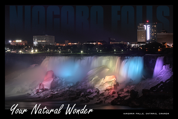
Ohmygoodness! I have seen so many photos of these striking, magical falls, and they never get old or cease to look amazing. But THIS one is the best I've ever seen. Congratulations on absolute perfection. I feel sure that there is probably not a better postcard of this place out there!
Thanks, everyone, this feels really good! Love being on the front page of a challenge, and I appreciate you taking the time to leave your comments.
@ jeger There's almost never a time when there's no mist. The less wind the better, of course, but the rush of the water causes an almost constant, impenetrable wall of fog.
@ basssman7 Any time, Ernie. May is beautiful 'round these parts, as you well know. ;-)
Regarding the location: Yeah, these are the 'Merrican Falls, but as seen from the Canajun side. I had fully intended to get the Horseshoe Falls, but I just never caught a suitable shot, for the reasons I mentioned to Jonathon. See?
Great shot David. Last time I tried to shoot the falls I got bad results because of all the spray off. I wonder if there is a good time of year to avoid excess spray?
David, congrats on a top 10 in one of the highest scoring challenges I have ever seen on dpc!
I do have to ask though..why the shot of the American falls and not ours? I know it is easier to shoot......but then the text should read NF NY, not Ontario Canada?
I might be back up that way for a weekend in the next month or so. If I get up there I will let you know and we can go for a shoot.
Great use of the text to your entry. Disciplined, and to the point. As for the photo, you did a great job. No overblown colors or lights, very smooth sharp look, and not alot of noise. I gotcha in my top 5, good luck.
Great shot, but you've gone way over the top with the text. The text you have at the top while being a clever effect, makes the whole scene look small, and part of the wonder of the falls is their sheer size.
Best use of type in the challenge, some one has their graphic design chops down. the image is not the most amazing in the challenge, but it certainly nails the challenge, ought to be top five.
There is just one thing wrong with this image and that's the top title - it flaws an other wise spectacular image and good use of other fonts and placement. The top font should stand out just a little more to make it a completely effective and dramatic representation of a natural wonder.
Wow, a toss up between this Niagara and the other one. The multiple colors and more skyline work well. I'd have to give this one a slight edge. Nice job.
Lovely!! I like the faded text at the top (a bit hard to see though, don't be surprised if many do not see it). Colours and exposure are great. Not sure I like "your natural wonder" text at the bottom.






 Add photograph to your favorites
 Add photographer to your favorites

 Photographer found comment helpful.