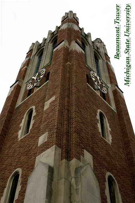
Ok - this may sound really strange, but why the vertical image and the vertical text? This would have worked with a smaller size on the font and a shorter drop shadow if it were place in either corner of the white space - with is also a problem. The drop shadow wasn't a great choice either - that just makes your eye water and keep crossing and uncrossing.







 Add photograph to your favorites
 Add photographer to your favorites


 Photographer found comment helpful.


