|
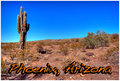
A difficult shot and way too much light blue to be truly effective. The white haze blending into the blue sky creates a border within the image that is distracting. You might have done better to crop the bottom off thus making a little tighter shot and a little more impact. The image also isn't level - it tilts up to the right (or down to the left) which creates an uncomfortable feeling on first viewing. A contrasting font color would have worked much better. |






 Add photograph to your favorites
 Add photographer to your favorites


 Photographer found comment helpful.


