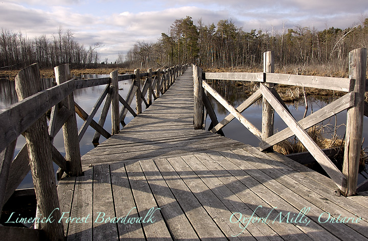
Well, it's just what it says...part of a boardwalk in the Limerick Forest, approx 5 minutes' drive (and 25 mins' hike into the woods) from my house. Shot on a day when the light was poor and watery, but that may add more interest to it than one heavily shadowed and saturated.
pp: RAW conversion, select, curves, contrast, crop, curves and contrast again, saturation, warming filter, resize, usm 2x, text, colour, save for web
Statistics
Place: 67 out of 163 Avg (all users): 5.8286 Avg (commenters): 6.5000 Avg (participants): 5.5179 Avg (non-participants): 5.9748 Views since voting: 887 Views during voting: 302 Votes: 175 Comments: 12 Favorites: 0
I can only imagine how pretty this place would be once the leaves come out.
The composition for this shot is ok but I find myself thinking of some different shots to try. One that sticks out in my brain the most is lying right down on the boardwalk. It also looks like you are at a corner or turn in the boardwalk. It would be cool to see both parts of the boardwalk.
Aside from that? The lettering is hard to read against the image. Minor thing to me as its a photography contest in the end but something to consider anyways.
The light was actually quite lovely for this, Susan! Really has a nice quality to it and gives those gentle crossed shadows on the boardwalk. Great composition with the boardwalk leading us to that stand of trees, and exceptional clarity and crispness of the scene. Really does invite one to come visit - such a peaceful, lovely place!
The walkway is too centered for me; I'm led up the image but am almost rushed through to the other side, and I miss teh water and reflections along the way.
The color of your text blends into the wood; the overall lack of contrast except for the far left makes it hard to read.
A great image of the sportsmen's paradise that is Ontario. The font selection is good, but a little more contrast with a different color other than a pastel would have worked better.






 Add photograph to your favorites
 Add photographer to your favorites

 Photographer found comment helpful.


