My first thought: Nothing interesting to grab my attention.
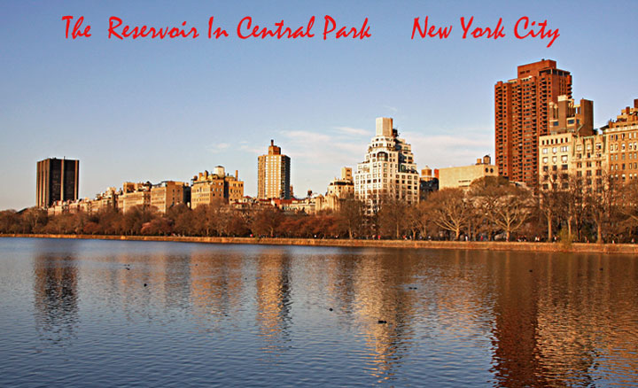
The water in the foreground attracts a lot of attention (which could be the case as your title is reservoir related), but the buildings overcome this, in essence my attention is divided between the two. Also the buildings in the background are not sharp. Water has a lot of distractions as well which could be cloned out for presentation. the color on buildings seems off and brown doesn't go very well here.
Nice scene, but tons of JPEG compression is taking away detail. Artifacts are visible in the sky around the text, but I think the compression is also taking some detail away from the buildings. At a 93k file size, you still had lots of overhead to use less compression.
Well, the text tells me where it is, but the picture quality (ok, fairly typical for a postcard) and the general tedium of it all makes me wonder why anyone would send a postcard from there.
The colors are bland and there is a little too much water to be an effective treatment of Central Park. The font is fine, but the color clashes with the overall tone of the city. The little spots on the water don't add to the image at all.






 Add photograph to your favorites
 Add photographer to your favorites


