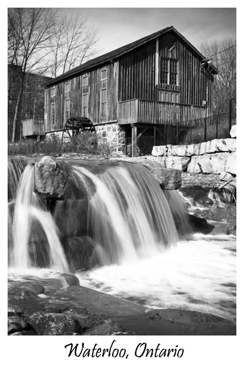
First off, congrats on your new PB by quite a ways! This really is an excellent submission. It meets the challenge head on (it really looks like it could be a postcard) and it's a beautiful shot. Excellent use of border and text as well. In the image itself you combined several DPC friendly elements, and they paid off. You've got smooth water, great composition, a lovely landscape and a nice B/W conversion.
There are only a couple of things that I see that may have brought your score down a bit. First, the whole thing feels like it is leaning a bit to the right. That may or may not be true, but I would prefer a small rotation. Second, the white water in the foreground is totally blown out. The B/W helps that, but it's still a bit distracting. Finally, it could be sharper. You might want to check out this thread on Adamus sharpening. I bet it would work wonderfully on this image.
Overall, a great image, score, and placement. My recommended tweaks are pretty minor, but they may have improved your score a little. Great job!
If you have any questions or comments just shoot me a PM.
Nathan
An iconic image well composed and captured. Proper font selection, proper color and proper placement outside the image. I'm not much for the whole flowing water technique as it's become a common meme with digital water shots - it gets a little old, but it works here - not effectively, but it does work.





 Add photograph to your favorites
 Add photographer to your favorites

 Photographer found comment helpful.


