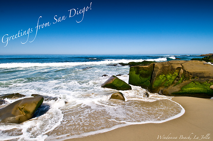
The horizon is too centered, in my opinion. Pushing it up a bit, and making the upper text horizontal, to mirror the text in the opposite corner, would help balance this shot.
The font choice and placement is good, but I honestly don't know what to say about the image - the rocks in the foreground have an almost 3D look to them which doesn't quite match the rest of the image. I don't mean in a composite sense - that's not an issue, it just seems like they are more precise than you would expect compared to the rest of the image. Nice composition which reflects the nature of the area.






 Add photograph to your favorites
 Add photographer to your favorites


 Photographer found comment helpful.


