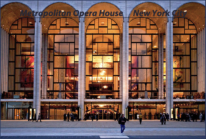
This was my first image where I added both text and a frame in photoshop. Since everyone is commenting on the font and the color, I will say that it looked better (darker and bolder) before I reduced it and posted it on the site but by then, since I hadn't saved it along the way, it was too late. And I could not figure out how to get rid of the underline once I put it there, so I just moved the text to where I thought it would be noticed the least.
Live and learn (as in, it took me most of an afternoon to learn - now I have to live with it). I'm glad I did it anyway.
Statistics
Place: 135 out of 163 Avg (all users): 5.0237 Avg (commenters): 5.0000 Avg (participants): 4.9474 Avg (non-participants): 5.0625 Views since voting: 808 Views during voting: 319 Votes: 169 Comments: 9 Favorites: 0
I like the author's intent here, but the focus is softer than it should be. If it were sharper, it would have been a great image. The font selection is good, but the underline is not necessary and the color choice was less than thoughtful. It does what it's meant to do though which is represent the Met and it's majesty - it just has those few flaws that mar the overall impact.







 Add photograph to your favorites
 Add photographer to your favorites


 Photographer found comment helpful.


