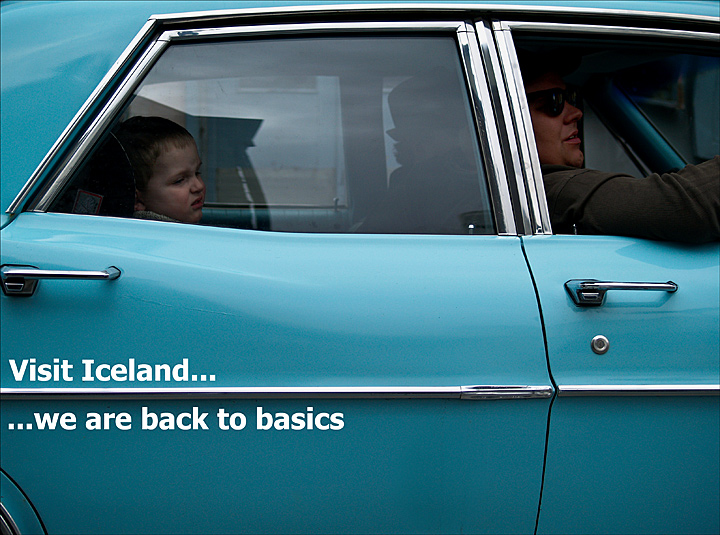
We Icelanders have been hit hard in the global financial downturn. We need to go back to basics. Old cars drove around downtown Reykjavik this weekend to promote a blues festival. I thought that was symbolic for the situation. We could use this image on a postcard to seek more tourists...could´t we?
PS: Crop, levels, curves, resize, dodge, spot healing, adding text, flatten image, USM, frame and save for the web.
Camera Model: E-510
Equipment Maker: OLYMPUS
Date Taken: 4.4. 2009 14:29
Color Representation: sRGB
Subject Distance:
Flash Used: No
Focal Length: 40 mm
F-numer: F/3,5
ISO: 100
Exposure Time: 1/640sec.
Metering Mode: Pattern
Exposure Compensation: 0
Statistics
Place: 140 out of 163 Avg (all users): 4.9822 Avg (commenters): 5.7143 Avg (participants): 4.6842 Avg (non-participants): 5.1339 Views since voting: 770 Views during voting: 354 Votes: 169 Comments: 16 Favorites: 0
I love the tongue in cheek approach you took to this. Not a flashy post card at all, but if I were to buy a post card, this is the type I would buy. 7 for now, but I will likely be back to bump this up a bit more.
Not the most amazing image, but it sure gets the point across, and I love how you crowded the edges of the crop, it gives a pinched, constrained feel to the image that works perfectly with the child's expression. I'm hoping it makes the front page.
I'm not sure this works as well as it could and I'm not at all sure about the author's intent. As an image, it's nicely detailed, nicely composed and executed, but the point of a postcard image should be to entice the viewer into good and positive feeling about the location - this doesn't quite do it. I'm not at all sure about the meaning of the title as opposed to the image either - it seems to me to be a mixed message with the unhappy child.
I dont get it. I dont like the picture. The child looks like he wants to throw up. Its just not at all something I would send someone from Iceland with all of its majestic beauty to be in a picture.






 Add photograph to your favorites
 Add photographer to your favorites

 Photographer found comment helpful.


