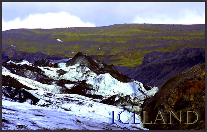
no vote, commenting only. Have not seen the actual place , so difficult to comment. I can see a little too much cyan saturation (at least on my screen). Especially obvious in the clouds.
The image looks a little washed out - maybe a little tighter shot on the hiker in the background would have helped a little. The darker scene and colors made for a difficult shot and the lighting conditions didn't help you any. I like the way you handled the font colors - not a great composition, but it does invoke the nature of Iceland.






 Add photograph to your favorites
 Add photographer to your favorites


 Photographer found comment helpful.


