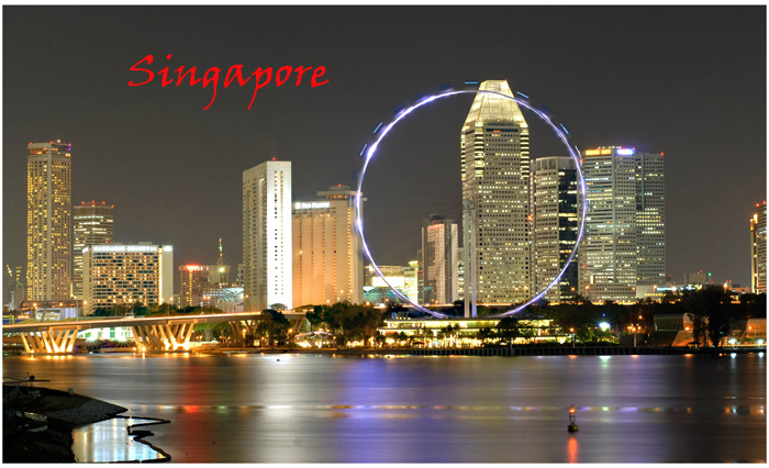
I like this, but there are too many distracting elements to make it an effective image for commercial post cards. As a personal note, this would make an interesting image, but the soft focus and the long exposure created a negative effect with the ferris wheel.
Beautiful shot. One tiny nit-pick: I wish the word "Singapore" was slightly more to the left. I think it would balance the image better. Hope you don't mind me mentioning it. Good luck.
the ferris wheel really makes with picture but i feel like the red lettering takes a bit away from it i wouldve liked a color that matched that of the lights on the wheel for example






 Add photograph to your favorites
 Add photographer to your favorites

 Photographer found comment helpful.


