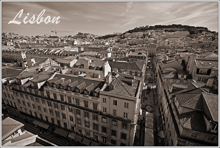
I imagine these buildings are very colourful and I'm not sure why you would choose to change it to a B&W shot.
If you had kept colour you would have the contrast of the whites and yellows of the buildings against the blue of the sky, which I believe would have looked a lot nicer. As it is, with the B&W it just looks quite flat and uninteresting.
Perfet composition. The dramatic angles, the crisp sharp image and excellant tone control with the off color cast is very inventive. The font and placement isn't the best as the white contrasts too much with the excellant imagery.
Great cityscape and works very well in b & w. Shame about the construction cranes in the background... rather detracts from the positive publicity aim of a postcard.






 Add photograph to your favorites
 Add photographer to your favorites


 Photographer found comment helpful.


