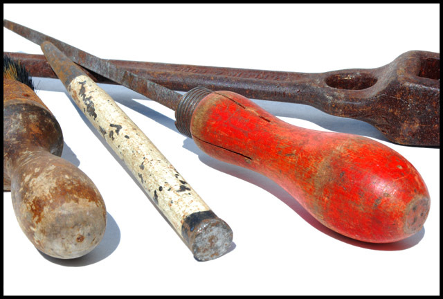
I do like the brightness in this image but I'm not fond of the shadows. Maybe a fill light from the top right would help minimize that. Also the tool on the left might have been better placed by turning it around so that the brush is in the foreground. You have the similar textures on the other 3 tools and the shape of that one is similar to the red one so turning it around would add not only interest but bring in another texture which is lost off the screen on the left. It also looks like that one has more rust on the other end of it too. Overall well done.
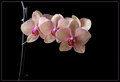
An image that demonstates the subject matter of the challenge in spectacular fashion with excellant DOF and color control. Both a technical and artistic success that more than adequately meets the challenge subject in particular with the color shades. A very worthy contender for top ten honors and a possible ribbon contender.





 Add photograph to your favorites
 Add photographer to your favorites


 Photographer found comment helpful.


