I don't expect to go far with this because it is not a landscape. I am not a landscape person.
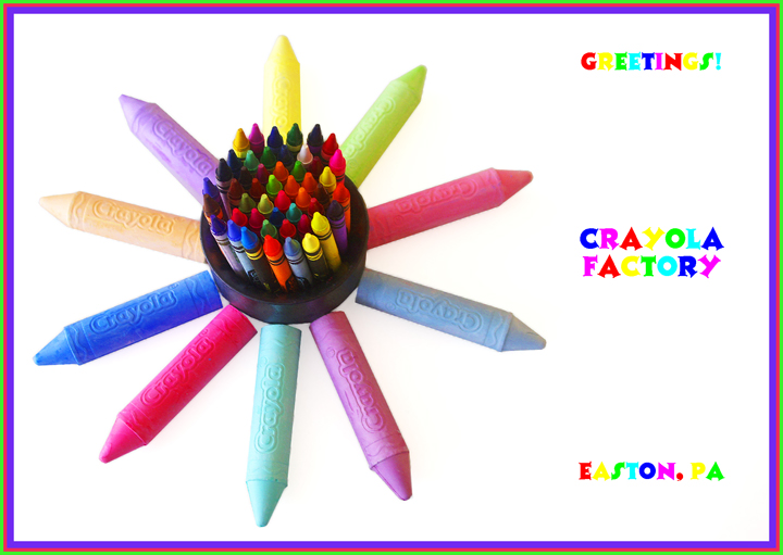
Post processing: cropped; using the marquis tool selectively adjusted brightness and levels (on background) and saturation on crayons; added text.
Statistics
Place: 108 out of 163 Avg (all users): 5.4398 Avg (commenters): 6.3571 Avg (participants): 5.1964 Avg (non-participants): 5.5636 Views since voting: 974 Views during voting: 368 Votes: 166 Comments: 15 Favorites: 0
Already voted, coming back to comment now. I love this postcard and picture. My only suggestion would be that the yellow letters in the words are very hard to read. It might have been better if you could have changed those to orange so they could be seen better. I love the playfulness though and the boarder is great. 9
Total effect is great - unfortunately, the choice of colors in the font is a minor flaw - the yellow disappears into the white and isn't distinctive enough to stand out against the stark background. Same with the yellow crayon - it disappears as compared to the others. If the yellow were changed, or a contrasting drop shadow used, it would be much more effective.





 Add photograph to your favorites
 Add photographer to your favorites


 Photographer found comment helpful.


