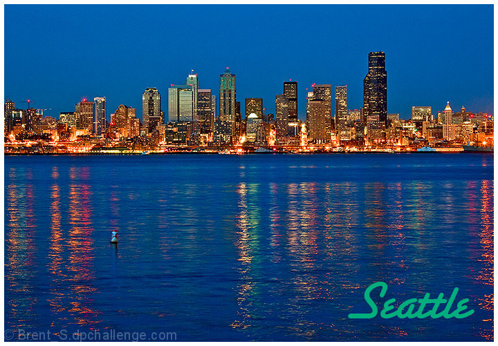
When reviewing competitions like this, city scapes seem to be the thing to do and it's hard to view another image and stay fresh while reviewing so that you give the authors a fair shake. Then up comes a fresh treatment of a city scape and you are renewed. This is one of those images that, while similar to the others, is very different in how it was handled. The reflections are perfect and compliment the light and structures in a pleasing way. The subtle change from brilliant colors to pastels on the water is very pleasing to the eye. The font is good, the color might have been a little more subtle to compliment the image. Well done.
Nice colors, nice reflections, nice composition. But a bit of halos around the buildings. Can't put my finger on it, but too much contrast or saturation??? Otherwise nice image.






 Add photograph to your favorites
 Add photographer to your favorites


 Photographer found comment helpful.


