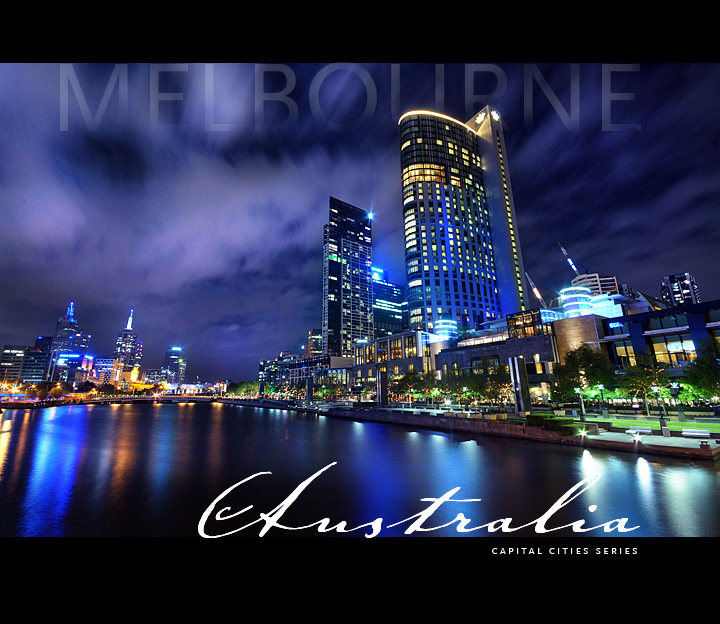
The Image: This is the Yarra River that runs through our city. It was a great night for the shoot. Shot at night on a tripod with a my new remote shutter release. Best thing! The colours in the original are not far off this. I do like the skewed perspective and am pretty pleased with the image.
On the right is the Crown Casino Complex. I was on a bridge overlooking this.
There was enough wind to give me nice water over the 30 second exposure.
The Edit: Levels, USM, Colour balance adjustment layers and masks, vibrance, some dodging and burning, resize, smart sharpen, a final levels adjustment.
I added the text which is Scala Sans Caps for the capital letters, and Johan Sparkling for the Australia text.
I like it overall...I would buy this card.
[Apr. 8th, 2009 01:40:34 AM]
DURING THE CHALLENGE: This has been around 8'3's for the first 30 votes...now around 7.9 with just over 100 votes...this should be my new PB and hopefully a BLUE!
I must say I love this image. I keep looking at it and see new details in it all the time. I love how the text worked out in this, and the fact that so many people like it.
If this wins, I will have three images on my front page that actually have text on them - legally. Maybe I should have been a desktop publisher! I must admit, I am a fontaholic! Thanks everyoone!
POST: Thanks everyone...a new PB for me, finally after a couple of years! Appreciate all the votes and comments...
Statistics
Place: 2 out of 163 Avg (all users): 7.7706 Avg (commenters): 8.9032 Avg (participants): 7.6452 Avg (non-participants): 7.8426 Views since voting: 12657 Views during voting: 463 Votes: 170 Comments: 95 Favorites: 28 (view)
Love the overall blue tone to the image, well composed and exposed. The moving clouds add to the picture and 'MELBOURNE' blending in is a nice touch.
If I can have a wish list: Not this wide a border, a 2x3 landscape image I would have liked more. The water was a little more smooth on the left bottom corner.
Overall an amazing image, a postcard that I would definitely I would consider buying.
i felt in love with the photo after first viewed in FB, i registered here so that i can participate in voting! (how can I?) HOTPASTA, this is superior photog and post processing is excellent!
Well done on a new personal best! Interesting how the wind you mentioned helped smooth the water, but it's effect was buried in shadow in regards to the trees.
Cool Enzo-- Your ghosted font really put this one over the edge. The photo is fantastic and in the context of the challenge, the font made for the perfect image.
This is a great postcard, I'd buy it! However I am conflicted on whether or not the composition would be as amazing without the excellent choice of fonts and borders. But whatever, great shot.
Enzo, you really outdid yourself (which is saying ALOT) on this one. You have to be so proud of how this turned out. Congratulations on 2nd place! And 7.7+! Wow! Worth every single fraction of a point of it!
I had a feeling this would be one of the winners, simply because of the layout, fonts. I haven't been to Melbourne since 1979, I'm sure it's come a long way since. As an Aussie, I can't fail to admire this one. :-)
Congrats on the new PB and the ribbon, Enzo! Truly a beautiful shot and all the more so (in my opinion) because of the wonderful skewed perspective. Wide is awesome, isn't it?
THIS IS MORE THAN AWESOME .. totally spectacular ..
the photograph is amazing, your processing superb and the way you've included the text is magic ..
CONGRATS on such a deserving ribbon .. 7.7706 WOW .. !!! ..:)
Enzo, I had this one and RulerZigzags (6th place) pegged as yours. Glad I got at least one right ;-) Gorgeous postcard - I'd buy it. Definitely. Congrats on your ribbon.
Everything about this image makes me want to go visit this wonderful city. This is a 10 all the way for me. Voted earlier in the week, just stopping by to comment on a few of my favorites.
Ok, so you look like you've taken a couple photos in your time. Absolutely great job. The text, the composition, the colors, sharpness, and even the location all stand out to say I'm a solid top vote getter. Great job.
One critique, a standard postcard normally isn't so square. It probably would normally need a more 4x6 orientation.
Great view of Melbourne and some nice vivid colours. I would like to see more of the left bank as this shot leaves me feeling like I'm missing out on something of interest there and feels a little off centre as well.
I'm not sure about the thickness ofteh borders, cards do have think top & bottom but that maybe a bit much... On saying that, awesome shot man. Go Aussie.......! 9
This is a postal card I'd buy if I was on Melbourne!!! It really makes me want to visit it...
Maybe if I ever make to that side of the world, you can sell me one... ;-)
Perfect - simply perfect from the colors, the theme, the subject and the font and font color. The Melbourne fade effect is incredible - a pro quality shot. Extremely effective, dramatic and purposeful. Well done.
Hot Pasta I assume? What a great image, and your processing makes it an excellent postcard as well. Both your tones and colors are contrasted perfectly, exposed well throughout. Oh and the different types of fonts might bother some picky voters, but im not nitpicking..8
Wow, stunning! Great sky, great colours. My only nit-pick is the border and the words "capital cities series" at the bottom. A bit overkill. I'm giving this a 9, would give it a 10 if not for those 2 things.
The picture and the lettering at the top are both very stylish.
The lettering at the bottom and the thick black borders, I'm not so keen on. Good luck.





 MY MELBOURNE
 Add photograph to your favorites
 Add photographer to your favorites

 Photographer found comment helpful.


