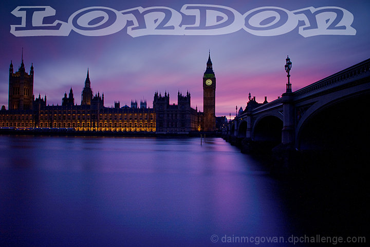
Nice shot, though I would have liked to have been able to see a bit more detail, perhaps a bit more exposure would have helped. I don't think the text really fits well with the placid sombre mood of the photo.
great shot. You got a better sky than the day that I got for my entry...
not sure about the font for the txt.. it takes too much away from a great photo IMO
Dorky text. Interesting moody capture of Westminster, but the text breaks the mood in addition to being unnecessary for such an easily recognised landmark. More picture points than postcard points then :)
This works great even with the over large font. The gentle gliding river is very effective and the soft flow of the light on the building is very effective. The details on the tower and clock are perfect. Very well done.
Fab shot of Parliament, lovely light and colours. Have to say that I'm not keen on the font you've useed for the postcard though; I think something a bit more traditional would have suited the image better.
really nice lighting and colour, bit I would have preferred more sky than Thames as it looks busy at the top and empty at the bottom...just an opinion...8 in any case






 Add photograph to your favorites
 Add photographer to your favorites


 Photographer found comment helpful.


