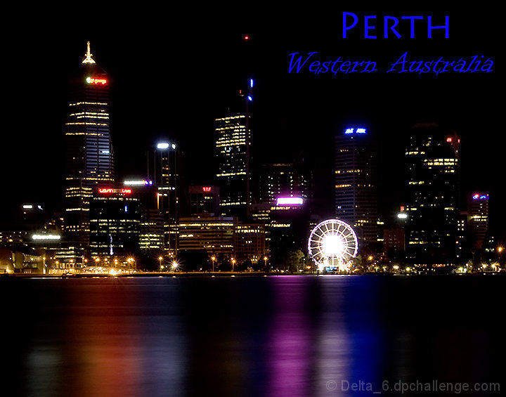
Neat shot but not a neat postcard - in my arrogant opinion (sorry about that). Without the text it's anywhere - ok so the text takes care of that, but...
Nice reflections/colors in the water. The skyline buildings are illuminated nicely. However, the skyline/buildings get lost in the black sky, which doesn't make it standout for me. I'm guessing the image was taken well after sunset, I wonder how it would compare if the photo was taken in the "blue hour" right after the sun goes down but the sky isn't totally dark. I'm thinking the building lights would be on by then but you would capture the buildings against a lighter/blue sky and the buildings wouldn't blend into the sky. Just my very amateur humble opinion...
What is it with you Aussies and the great images y'all produce? :>) The highlights are a little over done and the central ferris wheel bloom draws the eye away form the rest of the almost perfect image. The font selection is good, but the color should be a little more subdued - that's a personal selection as it works are it is. Nice composition and good execution with a couple of minor issues.
This is a lovely exposure, but it think it would have looked more "postcard-like" if you had gone for the 4x6 proportions rather than this more squared up crop. That and the blown center on the ferris wheel are the only knocks on this fine image.
Very pretty but the text and the composition isnt really working. Makes to much on the top and not enough on the bottom. I probably would have cropped more of the water out and given it a wide frame and added the text in the frame.





 Add photograph to your favorites
 Add photographer to your favorites


 Photographer found comment helpful.


