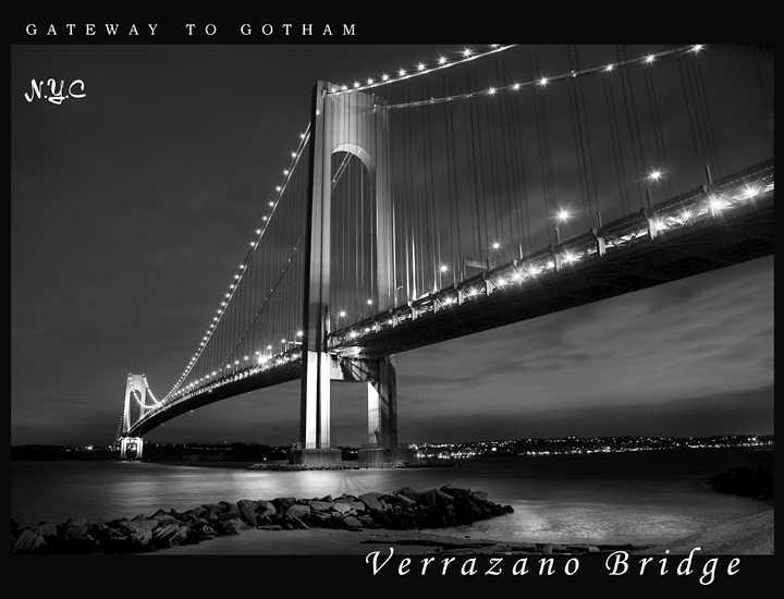
I haven't photographed this bridge in ages it seems, never thought I'd top my ribbon winner so I never bothered going back to the Brooklyn side again. But a new cam later and the new spotlamps on the bridge's towers motivated me to take the quick 15 minute trip and give it a shot. It was pretty windy out, had to play the wind between shots. I intended to make this B/W so I played with the WB hoping for the best exposure suitable for B/W. I could have had a brighter colorful sky but opted for a better tonal contrast on the Bridge's towers.
POST PROCESSING:
I named this after my other image used for the last Postcard challenge. This shot was taken from almost the exact spot I took my ribbon winner from. Figured it would bring me some luck, but this time trying Black and White. I converted original JPEG to grayscale, and besides taking 2 days just to settle on the text, I didn't edit this much, just some basic Curves and Contrast adjustments. I boosted the highlights on the rocks and water only. The one thing I couldn't fix was that damned distortion @#$*!
POST CHALLENGE: Top ten! Its not everyday that I get to be on the front page, thanks for all the comments everyone :)
Statistics
Place: 6 out of 163 Avg (all users): 7.2629 Avg (commenters): 8.5000 Avg (participants): 6.8852 Avg (non-participants): 7.4649 Views since voting: 4575 Views during voting: 375 Votes: 175 Comments: 36 Favorites: 5 (view)
this was one of my favs of the challenge, being from NY and all.
Your image is ethereal, the lighting stars, the conversion to B&W; I have seen this bridge in pictures thousands of times, and I do believe this is one of the BEST!
I had a hunch this was yours! Congrats on another 7.+, the foreground and the composition make this shot different, and the technicals are spot on. Congrats on 6th place this is awesome, 3 cheers for bridge shots
Using three different fonts I find to be distracting, as well as the NYC placement. The image itself is technically sound; well composed, and an excellent B&W
Well when its said and done this one made my top 5. I like how you drew out a very serine yet sophisticated look to your entry. I simple, its interesting, and its beautiful.
If I had one complaint, or critique it'd be I don't like the NYC text. The rest of the text seemed very discipined, and well put, but the NYC not so much.
A nice change of pace from the Brooklyn bridge. (Warning, nitpick ahead: Isn't the proper name the "Verrazano Narrows Bridge"?) Got any shots of the Throgs Neck?
Somehow looks more like art photography than a postcard, but I think you carried it off with the text and all. Even postcards should have some sort of market for good photography, no?
Technically excellant with one little white bloom near the center bridge support - good impact on the eye - very pleasing conversion using the light properly to create the ambience. You left a period out of the NYC. I'm not terribly happy about the font mix, but I'm a font Nazi. :>) I might have left out the NYC and just gone with Gotham - everybody knows where Gotham is. Well done.





 Add photograph to your favorites
 Add photographer to your favorites

 Photographer found comment helpful.


