Author Thread
Post actions
Ha! I didn't know this was yours. One of your 9's was from me.
Comments Made During the Challenge
Post actions
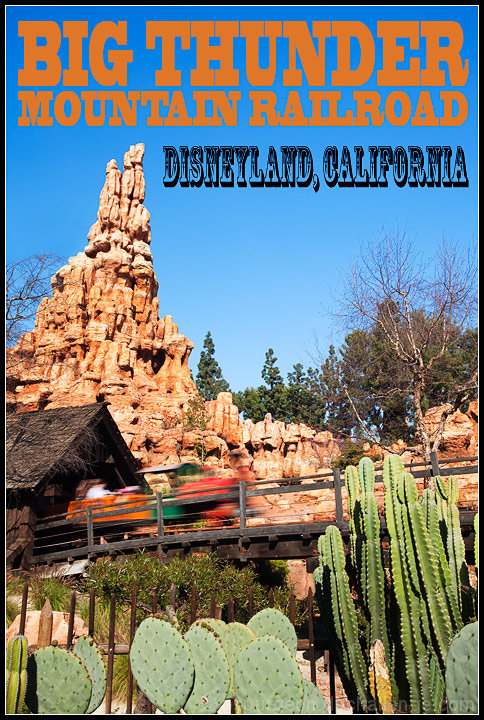
Looks like something I would find on the "local information and sights" rack at a hotel. Well done.
Post actions
Post actions
Post actions
Nice job with your editing.
Post actions
This picture is great, makes you want to actually visit Disney Land just to ride the ride!
Post actions
The text you chose really fits well here. Love the motion blur of the train. 8
Post actions
A different scene and a perfect representation of a theme park from the font to placement to the crisp, sharp scene with movement. Well done.
Post actions
There are alot of entries in this challenge that are better photographs than postcards, this is the opposite. Its a shame that the train is quite so blured, some helps, but this is too much (IMHO). That said everything else , especially the typography is prefect. top ten.
Post actions
Post actions
It looks like what I would expect to see in their gift shop for a post card. Nice.
Post actions
awesome choice of lettering and i really like the motion you captured







 Add photograph to your favorites
 Add photographer to your favorites

 Photographer found comment helpful.


