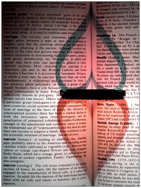
A twist on my other shot from the Shadows challenge. The same but with 2 light sources. I chose a page in the book about marriage this time - unfortunatly it's on the same page as marrows.
I taped paper on my lamp to so that only half the book was lit, then I clipped a flashlight onto my fly so that I could kneel taking the photo and light the other heart at the same time, controling the direction of the flashlight with some dodgy looking hip movements. Quite a clumsy setup but I think it worked pretty well :)
The torch I used was blue, so was the filter, so when I changed the hue everything went a nice reddy-pinky-romanticy colour :)
(CRW_8654.CRW incase proof is requested and I forget which file to submit)
Statistics
Place: 20 out of 221 Avg (all users): 6.0789 Avg (commenters): 6.8400 Avg (participants): 5.7624 Avg (non-participants): 6.2584 Views since voting: 2565 Votes: 279 Comments: 33 Favorites: 1 (view)
Sorry about that...
What I was trying to get across, was that I thought someone was copying your original picture, the one from the Shadows II Challenge, and I didn't think that was quite fair.
I really like this shot. If this aint Ben's shot, you did a great job honouring his work. I love the title as well, kinda like a continuation of the first, like in a series. The only thing I dont like is the shading on the top half. Whether is was intentional or not (lloks like it was to darken the top heart) I find it takes a tad away from it. Just my opinion tho. Good luck! This may ribbon! 8
And excellent evolution of Kondanor's tutorial. This is a great example of taking a fun idea and running with it. I like the way the two hearts end up with differing shades of red. And the placement with marriage is also excellent in holding with the two hearts idea. 10.
Aha - great rip-off of the original! Very nice exposure, exceptional composition, perfect focus. For the final "W"W" - try it again with a love poem or other more appropriate text on the page.
Great adaption of Konador's shot. I think your title is perfect, really adds that little bit extra to the shot. The white balance is good, focus is great, I really like this.
The only thing I might have liked was to have seen the title marriage a little clearer, maybe moved it down in line with the lens if that had been possible. Full marks though!
Nice multi-source take on it! Konador should be proud ... assuming you're not him of course :) A little more saturation in the hearts would be great, but presumably not possible with the multiple lights.
Oooh, this is going to be controversial. I've never seen it done with two hearts before, that is clever. It is a nice idea to put it on the definition of marriage page too. Good luck, hope you survive the comments :-)
I bet you already got a lot of comments on this picture concerning the subject??? I think thought that it is a really nice picture, but maybe next time you can focus a bit more on the words that get lit (sure, I see marriage there, but it is almost in the shadows...)
My mark isn't going to be biased by this - but this looks extremely similar to an entry from last year - maybe it's the same photographer. You may find that your marks suffer from DPCers who don't like to see the same thing more than once. Overall though, I really like this one - 9








 Add photograph to your favorites
 Add photographer to your favorites

 Photographer found comment helpful.


