Author Thread Comments Made During the Challenge
Post actions
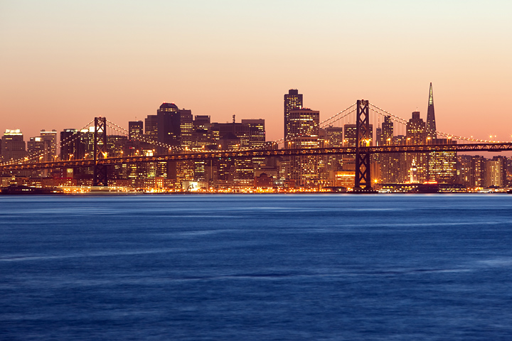
A little less water and a little more city would work better for me. 7
Post actions
I like the split color treatment. Looks kind of odd without the expected postcard text, but obviously you left the room for it.
Post actions
Nice shot, the colors are good IMO, I think a little less water would have been better JMO.
Post actions
Not good, this. I sort of know where it is, but you manage to make it look like a generic lump of industrial anywhere.
Post actions
i like how the color of the sky contrasts with the water
Post actions
A terrific image with contrasting color and tone. Very effective treatment of a city scape. A proper font and color for this would need custom treatment to compliment the image itself.
Post actions
Very pleasant photo, well done !
Post actions
The brown sky doesn't make this an enticing place to visit. The skyline building are nicely illuminated, but too much water and again the sky just looks smoggy.
Post actions
This is a little empty without a frame and text but still a nice cityscape.






 Add photograph to your favorites
 Add photographer to your favorites


 Photographer found comment helpful.


