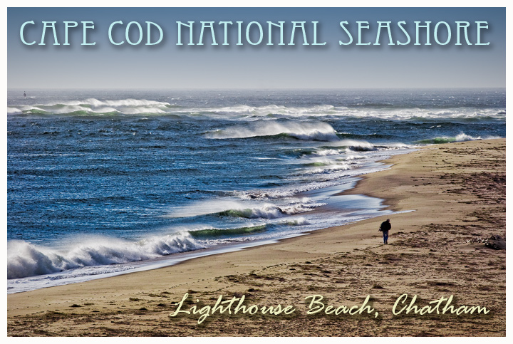
Very nice, the guy really makes this one. I think you have gone over the top with the text along the top though, and I don't like the use of the two different fonts and colours for the text. I would have preferred it if the top text wasn't there at all. Still, 7 from me, would have been 8 but for the text thing.
Really nice image - excellant composition with the slight angle of the beach - the lonely subject walking the beach is very iconic of Cape Cod and being a surf fisherman who has been at this exact spot, it's perfectly. It works as a post card in a lot of ways. The two fonts selected are very compatiable and the colors are fine. A very nice depiction of a national and regional treasure. Well done.
really nice that you have a walker there to add perspective...just an opinion, the two fonts don't work well together, but, after all, this is not a font challenge, so will mark it on the photo...7







 Add photograph to your favorites
 Add photographer to your favorites

 Photographer found comment helpful.


