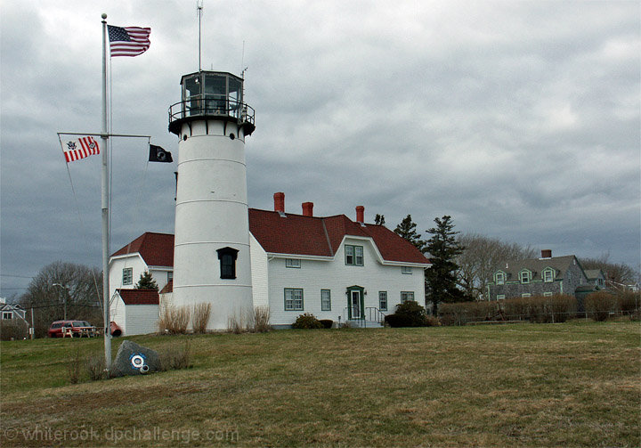
A nice enough scene, but it's coming off to me more like a good snapshot than something to advertise this place. You also could have cloned out that red SUV under the advanced ruleset, and that may have helped a little. Mostly I think it just could benefit from a little more massaging in post processing.
i feel like the flag pole is distracting and sorta wish the pic was taken from a little to the right of you possibly nice capture of the essence of cape cod though and new england in spring in general
no vote , just commenting. I feel that you cropped too tight at the top. Need a little more boost in the colors and a little more sharpness/contrast to make for an interesting postcard
Another iconic Cape Cod image which is nicely composed. I would like the dramatic sky to be a little more prominent in the image. The image is sharp, crisp, but it has the overall impression of a snapshot and not necessarily the kind of commercial art one would see on a post card. A little different angle with some work on the sky would have improved it's commercial appeal as a post card.
Im really not liking the colors and the composition. To many cars and power lines on the left. I would have cloned those out and cropped in closer to the lighthouse.









 Add photograph to your favorites
 Add photographer to your favorites


 Photographer found comment helpful.


