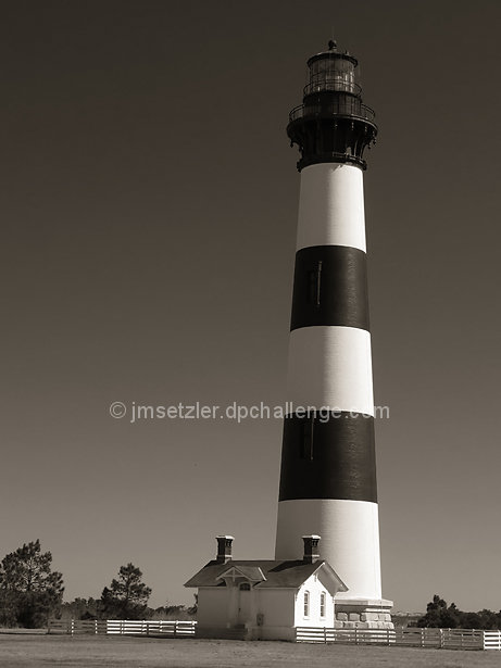
I'm not a postcard photographer for the most part. I rarely raise my camera at scenes that are postcard worthy. I find it really difficult to get something unique at a spot that has been photographed literally thousands of times by hundreds or thousands of photographers. When I do, since my preferences in photography are generally black and white, I tend to go that route, which is a rather major turn-off for the postcard crowd as well. I expect a dose of the standard "I would love to see this in color" comments... This particular photo does look really nice in color, and the sky is a nice deep blue behind the lighthouse in the morning sun. One of my simple philosophies of photography is that if the color is not adding major impact to a photograph, it comes out. This is one of those photos that can go either way for me. It makes a strong image in either presentation.
I had to attend a student conference in Virginia Beach, VA this week. I decided to get up really early and drive to the North Carolina Outer Banks on my way up there, so I left the house around 345 am and arrived in Nags Head just before 10am on Monday morning (3/30/09). I didn't have but about three hours to spend on the banks so I had to pick and choose what I wanted to do carefully. I knew I wanted to photograph two of the lighthouses and I wanted to catch the Wright Brothers Memorial as well. The Bodie Island Light Station was the closest lighthouse to the spot where I entered the Outer Banks, so I went there first. This lighthouse is 170 feet tall and was constructed in 1871 and 1872. This is the third build of this particular lighthouse. The first one was constructed in 1847 but not built on a strong enough foundation and it started leaning. The second build was completed in 1859, but was destroyed by retreating Confederate troops in 1861 who feared that Union forces would use it against them.
I dind't even realize there was a "Postcard" challenge up until Friday, so I thought I would toss this one in the heap just for fun :)
Statistics
Place: 107 out of 163 Avg (all users): 5.4438 Avg (commenters): 5.8889 Avg (participants): 5.2000 Avg (non-participants): 5.5714 Views since voting: 946 Views during voting: 289 Votes: 160 Comments: 10 Favorites: 0
A nice strong and smooth image. My only nitpick in there appears to be a slight tilt. That may just be a false perception on my own part. Popped it into my editor to check it, and it does indeed have a tilt to it.
This is a wonderful image with one little flaw - the light tower windows looks like streaks and are not defined. Those who are familiar with the light would know what the streaks are, but those who are could count this as an image defect. It might have worked to clone them out or maybe adjust the exposure to add some measure of definition to the windows. Otherwise, it's a wonderful image - very smooth and even tones from white through black. Effective use of lighting. Very well done.







 Add photograph to your favorites
 Add photographer to your favorites


 Photographer found comment helpful.


