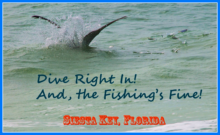
I'll be the first to admit - I'm a font Nazi. :>) In this case, a good attempt was distorted by the mixed fonts. Pick one or the other or at least try to match them up a little better - the antique block doesn't fit well with the script. The script color works well (even though I'm not a fan of script in general), but the red doesn't match the overall color theme. I've been to Siesta Key and you're right - the fishing is fine. A nice effort, but flawed.






 Add photograph to your favorites
 Add photographer to your favorites


 Photographer found comment helpful.


