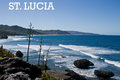
Funny, I looked at the thumbnail of this and thought, looks like the Australian outback, then I clicked on it and saw the text. Guess that means you captured the feel perfectly!
A good solid commercial image and very good font selection and placement. Not over whelming in any sense. I'd like to see a little more detail of the shadow, but that relates to the lighting - this might have worked better if taken early in the morning with softer light. Nicely done.






 Add photograph to your favorites
 Add photographer to your favorites


 Photographer found comment helpful.


