Thanks for all the comments . Your opinions and criticism are helpful ! I have only been using a dslr since January and I fell I'm getting better every month . Hopefully you comments and DPC will continue to make me a better photographer
Crop
Desaturate
Adjusted levels
Sharpen
Statistics
Place: 31 out of 163 Avg (all users): 6.3068 Avg (commenters): 7.3125 Avg (participants): 5.9655 Avg (non-participants): 6.4746 Views since voting: 1795 Views during voting: 382 Votes: 176 Comments: 17 Favorites: 0
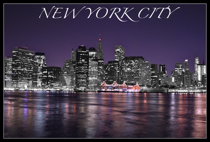
The lighting around that pier looks like bad haloing, but I do realize it is probably neon lights. Not sure I'm fond of the selective desat treatment, but I think that is a preference thing and you may get conflicting opinions on it.
I like your use of b/w and color in this scene. The only thing that bothers me is that the color to b/w transitions that are not on the waterline make the buildings appear to be cardboard. Also not so sure about the purple sky. But still overall I like it.
The combination of grayscale and color is very clever and in this challenge, out of the box from what I've seen so far. The font selection and placement compliments the linear form of the image and doesn't impose itself on the scene at all. Well done.
I like this postcard. Its unique in that the building in the skyline are B&W but one building has color. An interesting spin on the skyline. Well done.
cool view, one that isn't typical of the NY skyline... I must say though that either camera shake or something has made the details a bitty murky and the image could be sharper... gl
Did you desaturate the buildings? They look odd. If you did desaturate them, why? I like your font/text and the photo overall looks good except for the desaturated looking buildings.
id like to see what it looks like without selective desaturation. also the red light atop the empire state building takes away from that desaturation. last but not least the sky looks a little bit noisy but thats a minor thing
Nice job at achieving a strong Contrast. Not only are the colors great, but look better contrasted against the B/W cityscape. Center composition is a great choice here, just enough sky and water. The Font is excellent for NYC, reminds me of the font used for New York Magazine. My one gripe is the tonal range on the buildings, its lacking a bit in tonal range.






 Add photograph to your favorites
 Add photographer to your favorites

 Photographer found comment helpful.


