Author Thread Comments Made During the Challenge
Post actions
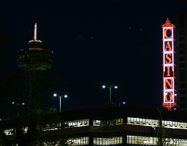
not to be too critical it is a little boring, needed some extra point of interest to make it stand out as a good night shot.
Post actions
Las Vegas is not the town for people with addictive natures. Good illustration.
Post actions
This shot is too dark and it is out of focus most likely do to camera shake. A longer exposure using a tripod would help immensely.
Post actions
The composition is bad, the large area of black space in the centre of the frame is ugly. Also if your depicting gambling as your habit I dont think this really hits the mark. A person leaving the casino looking like they've lost all their money would be an idea or vice versa a person leaving with wads of cash would say more than this.
Post actions
a little purple fringing but not bad.
Post actions
Post actions
the picture seems a little broad....it also looks like there are alien ships in the sky... I guess there's always Area 51... hehe
Post actions
Personally, I think the tower should be cropped out of this one. I think it fights for attention, and draws the eyes away from the Casino sign.
Post actions
Post actions
Too much central blank space. Unbalanced.
Post actions
Is that the Stratospere in the background?
Post actions





 Add photograph to your favorites
 Add photographer to your favorites


 Photographer found comment helpful.


