|
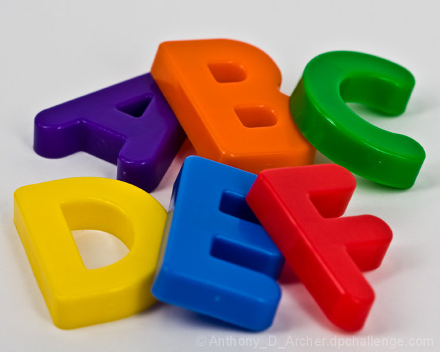
I think your depth of field may have been a little narrow, as there seems to me to be areas of softness on some of the letters, and I feel this all needed to be sharp. Also, the colours seem to lack the punch that could have made this really pop. Idea and composition was good though |






 Add photograph to your favorites
 Add photographer to your favorites


 Photographer found comment helpful.